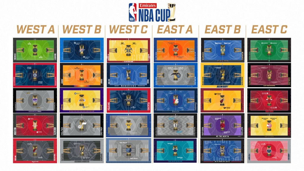
With every team about 10 games into the new season, the Emirates NBA Cup is tipping off on Tuesday, November 12. This is the second season in which the NBA has a mid-season tournament as part of its regular season. Last season, the Los Angeles Lakers won the In-Season Tournament, which has been rebranded this season as the Emirates NBA Cup, which my colleague Jeff Pratt did a deep dive into everything you need to know about the tournament.
Like last season, the court for every team will have a unique look during the games that are a part of the tournament. The games count as regular-season games but are also part of something separate, and the court designs help differentiate that fact. Overall, this season’s designs are a big improvement from last season’s, in my opinion.
The format of the tournament is fairly similar to last season with group-stage games on four Tuesdays (November 12, 19, 26 and December 3) and three Fridays (November 15, 22 and 29) before the knockout stage begins the following week. Quarterfinals are on December 10 and 11, followed by the semifinals and championship, which will take place in Las Vegas on December 19.
Last season’s court designs included fully painted and over-saturated colors from end-to-end of the court with the usual “paint” in the lane joined from end-to-end to create a unique “runway” through the middle of the court. It featured the trophy in the middle of the court along with the silhouette of the trophy in the lanes on each end.
This season, the NBA will try to highlight the Statement Edition uniforms in the court designs instead of the City Editions, which were used last season. The league-wide “runway” look is gone, thankfully, and instead, each design features three concentric circles radiating from the center court that represent the three stages of the tournament. Each team also uses an artistic “wallpaper” that covers the entirety of the court in a 30% opacity. Why 30%? As a shout out to the 30 teams in the NBA, according to the official site.
The teams also added their own flourishes around the court, which helps make the best designs stand out as elite.
Let’s count down all 30 new court designs for the 2024 NBA Emirates Cup from worst to first.
30. Utah Jazz
How do @utahjazz fans feel about the team’s new NBA Cup court? #TakeNote | @kslsports pic.twitter.com/qznNSyQ0Ww
— Ben Anderson (@BensHoops) October 24, 2024
Last season, the Jazz NBA Cup was ridiculously purple. They must have used up all the colored paint since this season’s has gone completely monochrome. There’s no need to adjust your monitor–it’s really just all gray, black and white. The mountains in the background are the only real character but it seems so weird without color. We’ve seen Utah lean into the sunset vibes on the surrounding mountains and its classic purple, but this season, there’s no color to be found anywhere. The massive over-correction is a major missed opportunity and lands the Jazz in the bottom spot in my rankings.
29. Washington Wizards
The Wizards NBA Cup Court 🔥🔥 pic.twitter.com/vQrLQ3elNY
— WizardsMuse (@WizardsMuse1) October 24, 2024
The Wizards have some color in there, which is enough to get them past the Jazz, but the “helping hand” highlighted across the court is strange. There are so many ways the team could have shouted out the old Washington Bullets logo from the 70s without it stretching unnaturally from corner to corner. The color and concept are solid, but the execution leaves lots to be desired.
28. Detroit Pistons
Our new #EmiratesNBACup court is here!
See it in-person at @LCArena_Detroit 11/12 & 12/3 pic.twitter.com/jpQyA1urr7
— Detroit Pistons (@DetroitPistons) October 24, 2024
Speaking of unbalanced graphics that feel over the top, the Pistons crammed multiple logos and wordmarks into their background. It feels like way too much going on, and it particularly feels weird to have “Detroit” flipped upside down right above “IN IT FOR MY CITY.” written in the other direction.
27. Miami Heat
Getting a new look for this year’s HEAT In-Season Tournament 👀 pic.twitter.com/mPVPqLxEne
— Miami HEAT (@MiamiHEAT) October 24, 2024
The Heat went to the opposite extreme from the Pistons and definitely can’t be accused of doing too much. It’s very, very basic, especially for a city and team as vibrant as the Miami Heat, who have so many good options to consider, but instead went with this.
26. Golden State Warriors
New NBA Cup court look 👀
We'll play our home games on this fully painted court throughout the tournament as we vie for the trophy pic.twitter.com/lZKUsA9FyJ
— Chase Center (@ChaseCenter) October 24, 2024
The Heat have a lot of fun ways they could have gone, and so do the Warriors, but both teams went basic and missed the boat. No bridge? No retro logos? This is what we got? They have the whole state of California to pick from! So many options, and all we get is a gray court with a stylized “W”?
The design itself isn’t awful just a lot of unrealized potential.
25. Brooklyn Nets
Brooklyn Nets NBA Cup court (via @washingtonpost). Herringbone is back in gray.
Thoughts? pic.twitter.com/NWEmSOoHPy
— Anthony Puccio (@APOOCH) October 24, 2024
Of all the mostly gray designs, this one is one of the better ones. It does make sense that it’s black, white and gray because at least that’s the team’s primary colors. The pattern, however, isn’t really working for me, though, and it reads a lot like watching basketball on a kaleidoscope court. Maybe if we rotate the end, we’ll get a different pattern.
24. Denver Nuggets
NBA Cup court reveal 👀 pic.twitter.com/D5t9mAt1og
— Denver Nuggets (@nuggets) October 25, 2024
We get it. Denver is at elevation. It’s in the mountains and is a mile high. Yes, that also equals 5,280 feet. That’s all the Nuggets have emphasized in the last few years in their city jerseys and alternate courts. At least it does say “Mile High City” in the background, not just 5,280, but just to make sure you didn’t get confused, they did include the conversion at the bottom of the court. It just feels tired at this point.
23. Orlando Magic
Magic reveal 2024-25 NBA Cup Court. #MakeItMagic pic.twitter.com/wSGvxVfmcF
— Magic Wired (@wired_magic) October 24, 2024
Well, this is one way to be sure the stars are on the court! I moved this court up several spots after I saw it with the player uniforms, so that does show that some of these more “basic” designs could be saved with the right uniform pairing. It’s still just a lot of stars, though, and the size seems off to me.
22. Oklahoma City Thunder
First look at our new NBA Cup court 🤩 pic.twitter.com/vXwVlLvcvE
— OKC THUNDER (@okcthunder) October 24, 2024
The Thunder went hard into the blue, and I don’t mind that at all. The logo in the background is where this one falls apart for me. It doesn’t seem quite the right size and is not very distinguishable.
21. Toronto Raptors
Our official @NBA Cup court 😈 pic.twitter.com/nZ8QMoCDZG
— Toronto Raptors (@Raptors) October 24, 2024
Well, I guess we know what the Jazz did with all the leftover purple paint from last season’s court. The purple force is strong with the Raptors this season, which I don’t mind necessarily, but the barbed wire stripes read less like pinstripes (like they do in the awesome city edition uniforms) and much more like yard-line markers on a football field.
20. Sacramento Kings
🔎#NBACup Court – 𝓡𝓸𝔂𝓪𝓵 𝓒𝓸𝓾𝓻𝓽
Circles symbolize the 3 stages: group play, knockout rounds, and the championship in Vegas.
The “wallpaper” Kings Crown design is in 30% opacity – a nod to all teams – gave each team an individualized design.
Kings will wear Statement pic.twitter.com/5W8QIDcLsa
— Kings Uni Tracker (@SacKings_Unis) October 24, 2024
I personally like the mountains/crown version of the Kings logo and the repeating lines out of the middle based on that logo work for me. The purple and black checkerboard on the lower sideline will tie in very nicely with the team’s statement edition uniforms as well.
19. Phoenix Suns
🔶 Bringing Out The Orange 🔶
Our 2024 @NBA Cup Court! pic.twitter.com/iLEnPl7WWJ
— Phoenix Suns (@Suns) October 24, 2024
The Suns are usually reliably excellent with these kinds of things, but this isn’t one of their best looks. It’s plenty of orange, but the giant PHX isn’t very inspiring. The gradient, which has been so great in the past, is just in the small strip by the sideline. Maybe the jerseys will help save it, but it’s definitely in need of some help to be one of the best in the set. As is, it’s in the bottom half.
The media team picked up the slack though, and put together this amazing timelapse of the court getting painted–it’s so cool to see this kind of artistry in action!
Paint the city orange!
PHX has a new look for this season’s @NBA Cup 🏆 pic.twitter.com/cV5BYsjOQ7
— Phoenix Suns (@Suns) October 24, 2024
18. Atlanta Hawks
Hawks unveil their NBA Cup court pic.twitter.com/5Nl9VBYSwV
— Zach Langley (@langleyatl) October 24, 2024
The Hawks’ look is actually not much different from the Suns. However, the yellow pops their logo in the middle and contrasts with the black and red. It’s a solid effort but nothing extremely inspiring.
17. San Antonio Spurs
Here is the Spurs Play In Cup Court shown via NBA 2K25 , #porvida fans . #nba #sanantonio #gospursgo (via @ohhhthatsMari ) https://t.co/CNsjgAUcZy pic.twitter.com/vHsVq50vG9
— JeffGSpursKENS5 (@JeffGSpursZone) September 19, 2024
Look! More black and gray! At least with the Spurs, it’s the right color scheme for the team. I like the Spur in the state outline, but it just reads very dark overall. It’ll be interesting to see how it plays in real life and if the details will be visible during the game.
16. Los Angeles Clippers
Sheesh… our new NBA Cup court is nice 😮💨
Come see it in-person at @IntuitDome 🎟️ https://t.co/JsGGbMgJIL pic.twitter.com/KZZlwDZJbz
— LA Clippers (@LAClippers) October 24, 2024
The Clippers are squarely in the middle of the pack with this design. There’s nothing especially wrong or right with it. The new arena is outstanding from everything I’ve heard, but this court is rather run-of-the-mill.
15. Indiana Pacers
our new @NBA Cup court is here and it’s perfect 😍 pic.twitter.com/hnJrJ3TlRg
— Indiana Pacers (@Pacers) October 24, 2024
The Pacers went with “BOOM BABY!” as the wallpaper of their court. It was a phrase popularized by Pacers’ legendary coach Bobby “Slick” Leonard during Pacers’ radio broadcasts. It’s a cool callout and a solid color scheme. It should offer a nice contrast with the team’s gold or yellow jerseys.
14. Milwaukee Bucks
Introducing our new NBA Cup court. 👀 pic.twitter.com/WVdLCqnJdU
— Milwaukee Bucks (@Bucks) October 24, 2024
The Bucks put their antlers on each side of the court and went with “Fear the Deer.” I’m good with the look overall, although the Antlers seem a little squashed and stretched, which makes them feel unnatural. I like the Cream on the ends of the court, but the blue instead of the green feels just a little off with the green logo in the middle. The uniforms could potentially help make this work, but it’s still in the middle at this point.
13. New Orleans Pelicans
Introducing the 2024 NBA Cup court design for the New Orleans #Pelicans 🏆
(HD render made by me so details may not be 100% accurate) pic.twitter.com/bpmoqun5Iw
— Pelicans Uniform Tracker (@PelsUniTracker) September 20, 2024
I like the red and blue instead of the neon green, which was featured in last season’s court. The large Pelican logo is cool, although not quite intimidating since it’s… ya know, a pelican.
12. Memphis Grizzlies
"It's all about business, so I like it" 🔥
The Grizzlies players react to seeing their new #EmiratesNBACup court design! Action tips off Tuesday Nov. 12 at 7pm/et on NBA League Pass and TNT! pic.twitter.com/2TB2K6S2QI
— NBA (@NBA) November 8, 2024
The Grizzlies have good looks across their uniform kit for the season, with a vern smooth ABA shoutout and the always-popular Vancouver throwbacks. For this court, though, they’re pulling the soft blue from the Grizzly featured in the middle of the court. The “MEM” is a little gimmicky but works for this setup and does a good job separating the ends from the middle of the floor.
Now that we’re in the top 12, the rest of these courts are pretty good from here to the top.
11. Philadelphia 76ers
new court. 👀
76ers Cup Nights pres. by @ChickfilA | #EmiratesNBACup pic.twitter.com/anSaKM9M2S
— Philadelphia 76ers (@sixers) October 24, 2024
The Sixers started this process ahead of many teams with a circle element already in their logo. They nailed it though with the Stars in a circle. The script “Philadelphia” and “Brotherly Love” looks great on the ends. It’s all very solidly executed even though it’s not especially groundbreaking.
10. Cleveland Cavaliers
INTRODUCING THE 24-25 CAVS CUP COURT presented by @KendaTire. ✨
All 30 @NBA teams will play on fully painted courts throughout the tournament. Designed by artist Victor Solomon, the courts will be used during Group Play and the Quarterfinals, showcasing a league-wide,… pic.twitter.com/aP9kCVvp9O
— Cleveland Cavaliers (@cavs) October 24, 2024
The wine and gold Cavs’ colors go very nicely with the cup silhouette on both ends. On the ends of the court, the Cavs went with their “V net” logo from their old logo from the 80s. That element may have looked better with the light blue from the era, but it also shows well with this color scheme.
9. Chicago Bulls
Bulls NBA Cup court looks much better than last year’s pic.twitter.com/1tBdtvVMvM
— Will Gottlieb (@Will_Gottlieb) October 24, 2024
The Bulls’ court is similar to the Pelicans in many ways. The one main difference–their mascot is a Bull, which is a little more intimidating than a Pelican. The black and red also looks really nice after last season’s over-saturated red court.
8. Minnesota Timberwolves
our official @NBA Cup Court 🐺 pic.twitter.com/0x6WM5B0Wf
— Minnesota Timberwolves (@Timberwolves) October 24, 2024
The Timberwolves’ court is going to be one of the most controversial of the season with the bright green main color. The “aurora green” has been a mainstay for the Wolves over the last few seasons, and I really like the way they adjusted the logo in the middle to be darker but with the green highlighted in the sky and the wolf’s eye. I’m also here for the trees on the edge. The only thing here (and in several designs to come) is that there is definitely an “upside down” that half the people in the arena have to look at.
7. New York Knicks
This year’s NBA Cup court is 1,000x better than last years pic.twitter.com/dBCxyGGvdo
— KNICKS BEAST (@KnicksBeast) October 24, 2024
I’m with KNICKS BEAST on this one, but I actually think it’s more like 1,000,000x better. The blue and orange are great in this configuration and the New York skyline is impeccable on the lower half. More skylines to come!
6. Boston Celtics
Our NBA Cup court really pops ☘️ pic.twitter.com/VRex9Y1INd
— Boston Celtics (@celtics) November 7, 2024
The NBA Champs’ court features the No. 6 in honor of Bill Russell, so it seems fitting that it lands at No. 6 in my rankings. The green with the black around it and the parquet overlay works for me. Some people find the lines going different ways too confusing, at least before seeing it in action. Maybe it’s because I’m more used to the real parquet, but it doesn’t bother me at all.
5. Charlotte Hornets
🚨New court colorway just dropped🚨 Say hi to the new Emirates NBA Cup court!
🔗 https://t.co/1smD3VrVZ3 | #HiveMentality pic.twitter.com/R05JXyRPgW
— Charlotte Hornets (@hornets) October 24, 2024
The Hornets get all the way into the top five with this beauty of a design. I like the honeycomb pattern, which is right on brand for them, and I like the teal and purple colors. The only reason they’re not higher is that they had to include “THE HIVE IS ALIVE” for some reason.
4. Dallas Mavericks
BREAKING: The Mavs NBA Cup court just released 🏆 pic.twitter.com/22elxHNudQ
— MFFL (@Mavs_FFL) October 24, 2024
The Mavs nailed the skyline look, and Dallas’ distinctive skyline is very well represented. It’s simple, but the colors and logo work great, and things come together really well. The blue is on point given the team’s look over the years. No notes here.
3. Houston Rockets
Our official @NBA Cup court 👀#Rockets | #Liftoff pic.twitter.com/cmUZPlD4HH
— Houston Rockets (@HoustonRockets) October 24, 2024
The Rockets’ court design is a great one that I didn’t see coming. It’s just motion lines but gives the illusion of blasting through space. I know others have said it looks a little like a screen saver, but I think it’s a unique take and fits perfectly with their team name and look. The red and black is a great look for the Bulls, Rockets and the next team on the list…
2. Portland Trail Blazers
The @trailblazers court for the 2024 NBA Cup. It’s got roses. pic.twitter.com/8f3IsrFlQe
— Casey Holdahl (@CHold) October 24, 2024
The “city of roses” look is very well done and has been long anticipated. The black and red goes perfectly with the Trail Blazers logo in the middle. I’m a fan of the rose pattern, which is subtle enough but still distinct. The “city of roses” on the bottom is the only one-sided element in this design as well.
1. Los Angeles Lakers
Featuring the Los Angeles skyline for the first time, our official NBA Cup Court 💜 pic.twitter.com/i6D6fK651z
— Los Angeles Lakers (@Lakers) October 24, 2024
The Lakers will defend their In-Season Tournament crown in style with the best-looking court of the season. The skyline is very well done and works great with the purple and gold. The NBA Cup looks right at home, as it should, and the palm trees are incorporated seamlessly to give it a very L.A. feel. The added “Hollywood Stars” with the years of the championships are also extremely well done and enough to put this design into my top spot.
So what do you think of the NBA Emirates Cup courts this year as a whole? I really like some and was unimpressed by others, but overall, I think they are a huge improvement on last season’s look and theme. As we get to see them with the home team uniforms, it’ll be easier to decide which “complete looks” should help their teams move on and which need to be bounced in the first round.
Do you agree or disagree with my rankings? Did I miss a reason why your team’s court is great or did I like one that you can’t stand? Let me know on X @ZT_Sports, where you can find all my fantasy sports coverage on @DKNetwork and follow along for more fun throughout the season.
The Crown Is Yours: Sign up for DraftKings and experience the ultimate host for games and betting experiences!
I am a promoter at DraftKings and am also an avid fan and user (my username is z.thompson) and may sometimes play on my personal account in the games that I offer advice on. Although I have expressed my personal view on the games and strategies above, they do not necessarily reflect the view(s) of DraftKings and do not constitute a representation that any particular strategy will guarantee success. All customers should use their own skill and judgment in building lineups. I may also deploy different players and strategies than what I recommend above. I am not an employee of DraftKings and do not have access to any non-public information.