With the NBA season tipping off Tuesday, it’s time to get another season of awesome action from the hardwood underway. A new season means a fresh new set of City Edition uniforms to analyze, critique and (in some cases) enjoy.
The NBA has released a new set of City Edition uniforms every year since 2016. The concept is that the uniform is to “pay homage to the history and cultures of all 30 teams and their communities,” according to the official website. While these aren’t officially throwback jerseys, many teams choose to incorporate elements of the past or different eras in their team’s history.
Last year’s City Editions were showcased during the In-Season Tournament, but it isn’t clear yet if the NBA Cup will be tied to the this year’s version. Some teams have officially announced and revealed their City Editions, but most of the info comes from a leak in September that has been confirmed in every reveal so far. The leaked versions don’t include numbers or names, but for some designs, it’s enough to get a good idea of how they’ll look.
As is the case every year, some of these City Editions are a slam dunk, others are slightly off the mark and a few are total airballs. Overall, I’m not especially impressed this year. There is definitely one outstanding design that is by far the best, but for the most part, there are a lot of non-original ideas. I ranked less than half the uniforms in my “good” category and really only love the top five or six designs.
I think the NBA and its partners have done better in the past and can do better in the future, especially on some of the most important and iconic teams. While the overall set is a disappointment, there are some big winners.
Let’s take a look at all 30 City Edition uniforms and break down the best and worst of what to expect across the Association this season:
The Good
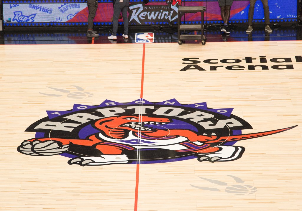
1. Toronto Raptors

There’s a lot of room for varying opinions on City Edition threads since they are “fashion” and therefore subjective. However, there’s really only one right answer to which one of this year’s unis are the best — the Raptors.
Not only did they bring back the dino on the front but they had him strike the pose of the iconic Vince Carter dunk wearing a Vince Carter jersey. It’s the kind of “jersey on a jersey” thing that is high-risk, high-reward, and they nailed it for this one. With the 30th anniversary of the Raptors franchise and Vince Carter’s Hall of Fame induction this year, this get’s the “chef’s kiss” for top design this season by a very wide margin.
2. Utah Jazz

The Raptors are really the only elite option, so there’s a pretty big dropoff before we get to No. 2, where I have the Jazz with their mountains look. It’s not terribly original or ground-breaking, but it’s different enough from their typical set and highlights a unique aspect of their location. They don’t threaten the Raptors for the top, but they’re the “best of the rest.”
3. Phoenix Suns

The Valley continues to be the focus of the Suns’ City Editions, and this time they bring back the purple and orange. These are inspired by the 1995 NBA All-Star jerseys with the lopsided star from the game’s logo and a fun Aztec pattern down the sides. The Suns are consistently near the top of any kind of jersey rankings, and they continue to shoot a very high percentage with this strong addition.
4.Memphis Grizzlies

I liked these when I first saw them but didn’t get the red suddenly bursting onto the Grizzlies pallette. Then I found out that these are red to celebrate the 50th anniversary of the ABA’s Memphis Sounds. The look is really completed by the shorts which have a great stylized “G” in baby blue that is a very nice callout to the Sounds. They’re not quite as good as the team’s awesome “Vancouver Grizzlies” throwbacks, but these are still great and will give the Grizz one of the best full uniform sets of any team this season.
5. Detroit Pistons

Pistons fans may still not have a ton to cheer for this year, but these jerseys should be a highlight. In many way, this continues the theme of last year’s City Editions which were inspired by the Detroit Bad Boys shirts from the late 1980s. The numbers 89 and 90 are subtly included on the side panel as well to commemorate the two championships during that era. The font and the colors on this are solid, and the lettering is unique, big enough and clean. It shouts out the “Motor City” with just enough vintage feel in the detailing.
6. San Antonio Spurs

The Spurs typically do the City Edition uniforms well, and this year’s light blue is no exception. I love the “Fiesta Spurs” and wish this had a little more color, but the font is fun and totally works for the vibe of the city, which is the whole idea with a City Edition. It’s a big departure from their standard black-and-white uniform set but only in the best way and remains recognizable as the Spurs. It is similar to last year’s, though, so hopefully we get some variety in next year’s version.
7. Atlanta Hawks

These are kinda fun! They continue the theme started last year with the inclusion of the light blue accents but this time are on a primiarly white jersey instead of black. The blue makes sense with the brand since it was their main color in St. Louis from 1965-70. I also like the slant on the wordmark which is also a throwback to their jerseys from the 1980s and early 1990s.
8. Indiana Pacers

Like the Hawks, the Pacers are keeping the same theme from last year and doing a light version of last year’s dark jersey. I actually think the bright blue and spray paint side panels work much better on white. I still don’t love the lettering and brushstroke look on the front, but these are fine and do work with the branding that carried them to the final of last year’s NBA Cup.
9. Golden State Warriors

How exactly the numbers work in the middle of “Golden State” will be critical, but the reds and golds on the trim work for me. They look similar to the 75th anniversary unis from 2022, which I liked. The nod to Golden Gate Bridge towers on the sides are expected to be connected with cables on the yet-to-be-released shorts, which could make this look rise or fall a few spots depending on exactly how it works.
10. Cleveland Cavaliers

I like leaning into the blue that the Cavs used in the 1990s and am a fan of THE LAND lettering. What I don’t love is the side panel. The “torn” look to reveal all the old logos and wordmarks reads a little messy and misdirected to me.
11. Houston Rockets

The “H-town” works for a City Edition with the colors and “BELIEVE IT! AGAIN!” inscription above the tag commemorating the 30th anniversary of the 1993-94 team. These aren’t anything exceptional but are a solid offering, which this year is enough to get into the “good” section.
These are the first of a few options that are “fine” and not ground-breaking but we aren’t quite to the bad or the ugly category yet…. just wait…
12. Portland Trail Blazers

The Blazers are back with “Rip City” on their City Editions and some fun plaid accents. The texture inside the lettering makes these fun, and it could be further boosted by exactly how the name and numbers are incorporated. After straining for a while, it looks to me like “Pacific Northwest” is included down the side of the jersey as well which could be a cool element.
13. Philadelphia 76ers

The Sixers jersey looks like a Sixers jersey–which is a good thing. The simple red and blue piping at the top is classic and the color panels on the side are a call out to Philly’s four main sports teams. I liked last year’s dark version of this, and this is a solid if unspectacular white version. Like the rest of the options in this section, it’s perfectly acceptable but not really ground-breaking.
14. Washington Wizards

The Wizards went away from the pink City Edition last year but went with a strange teal in their color pallette. This year’s version is a white-based version that leaves out the teal and includes the powdery trim that was inspired by the stones that mark the original boundaries of the city. I’m fine with these but not rushing out to buy one.
The Bad
15. Minnesota Timberwolves

The Timberwolves fit in a unique category for me. Based on what we have here, I would give them an incomplete. There are things here I like, but without the numbers and names, it’s really hard to tell which way these will go. The “Minnesota” looks very small in this version and is a little white-on-white, which has made Wolves’ fans howl. Still, with solid other parts of this set, I feel like there are redeemable pieces here. I’m putting it in the bad category for now, but I’m not totally out on this set yet.
16. Charlotte Hornets

Good news! We’ve escaped “Buzz City” and are back to Charlotte! Other than that, though, the minty green of these jerseys isn’t my favorite. They are almost exactly what the team wore a few years ago just with the Buzz City swapped with the Charlotte word.
17. Brooklyn Nets

The Nets went from one extreme to the other after working with local artist KAWS to create last year’s wild multi-colored City Edition. They drained all the color this year and just included it around the word “Brooklyn.” Overall, I do think it’s an improvement but still not a good option.
18. Milwaukee Bucks

To their credit, the Bucks seem set on getting blue into their City Editions. This is three straight years with “Great Lakes Blue” in the set. It just feels off, though, since blue isn’t really their color. The lines are supposed to represent the coast but seem to indicate a downwards trend that isn’t very encouraging.
19. Sacrameto Kings

The “Captain America” Kings are trying to call back their Cincinnati Royals days, but this comes out looking extremely non-distinct. Blue with red and white piping and such simple lettering feels very “youth basketball” in this design. The subtle crowns in the red stripe may be enough to save this design, but they’re so subtle it’s hard to count on them. If they were white, that might pop them enough to move them into the good catogory.
20. Los Angeles Lakers

For the first time ever on their uniforms, the Lakers are making “LakeShow” a thing. It seems like a dated reference, though, since I’m not sure anyone actually calls this version of the team that anymore. Aside from that weird step, the gradient also feels very off. I think a big part of it is the additional trim gradient, which takes these to a weird and bad place for me. These are definitely bad, but the scary thing is that there are still so many that I think are worse.
21. Oklahoma City Thunder

I promise I didn’t use Photoshop to take out “City,” which is an ironic word to leave out on a City Edition. It would be the first time that the Thunder have used just the state as a wordmark on their jerseys. The color scheme also hits a little weird, and I’m still not sure I buy the red/yellow/black look for the Thunder. Needs more blue and maybe some orange to feel more on-brand for them.
22. Boston Celtics

The Celtics’s jerseys are the worst of the bad. The greens on this are the wrong color, the side panel isn’t great, and it totally feels like a budget knockoff of a real Celtics jersey — maybe one that’s sponsored by Mountain Dew. Even though I’m a Celtics fan, I cannot get behind these at all. I have come around to being OK with them wearing black as a primary option along with white and green, but how did the greens in this version go so wrong? How did the Seahawks’ green get on this jersey? It doesn’t make any sense and is almost insulting to a franchise that just won the title and is one of the NBA’s most recognizable teams. It isn’t the ugliest of the jerseys in this year’s set (see below), but I do think these are the worst.
The Ugly
23. Bulls

The lack of color on this is brutal. The Bulls are red and black not beige and soft gray. I’ve been a fan of the team pulling in the Chicago flag, too, which brings in light blue. This doesn’t do that either and instead tried to rely on “bronze accents from the Michael Jordan statue in the concourse.” I respect the legend and the statue, but this uniform doesn’t respect the team’s color scheme at all.
24. New York Knicks

The NBA did its most iconic teams wrong as a whole this year in the City Editions, and the Knicks’ set is among of the worst. The double-stacked New York is not great and looks like a dropshadow experiment gone bad. It doesn’t help that the pinstripes are extremely subtle. They almost read like design guides that were accidentally left on in a graphic program during export.
25. New Orleans Pelicans

I might be able to get past the NOLA abbreviation, the voodoo font, the weird lime green accents or the bone pattern, but all of them at once? This somehow tries to do too much while also not doing enough. Ultimately, it feels like a knockoff Pelicans jersey that you’d find at a street market or on TEMU.
26. Denver Nuggets

These could have been great, but they’re not. The side panel’s solid and I don’t even hate the heat map/altitude mountains. However, I’m done with “5280” replacing the name of the team or city. Yes, you play at elevation, and that’s a cool thing to highlight, but do we have to do it every year? Also, there’s nothing in the trim around the neck or arms. Did they run out time? Did they run out of color?
Speaking of out of color–that brings us to this next section of ugly…
27. Dallas Mavericks

There are things about this jersey that I don’t hate. For example, the skyline on the longhorn in the corner and the nice design on the side panel. The problem is that there is just no color. The Mavs have done a great job with blues and greens in the past but get nothing here…. If you colorized this properly, it could move into the top 10, but as it is, it’s easily bottom five.
28. Orlando Magic

More monochrome! The Magic opted to go gritty, I guess, and call out the urban area around the arena. They also brought back a star for the “A” that looks very weird without the color and instead reads like something between the Cowboys’ iconic star or a Sherriff badge best left to one of the Texas teams. You know what the Magic need — some blue or gold in there!
29. Los Angeles Clippers

From one extreme to the other, we go from no color to way too much…The Clippers have no lack of saturation in their City Edition! It’s a little tricky to know how this is a spin on their new branding when that’s not very established yet, but the very simple “Clips” looks unbalanced and unfinished. It’s the same thing they had last year just with a light blue instead of navy, meaning that not only is it “unfinished” it’s also pretty unoriginal.
30. Miami Heat

The Heat are another example of plenty of color but not much originality. “Heat Culture” is a thing, and we get it, but like the Nuggets and “5280,” it feels like we need a different concept since this one is getting tired. I also really dislike how the word “culture” is so much more the focus than even “Heat.”
These also get some extra hate because we know how good the Heat city editions can be. I get that we can’t run back Miami Vice jerseys every year, but it’s been long enough — we want them back! The Heat used to be at the top of this list during the glorious pink and blue era but have now tumbled all the way to the bottom with these all-red versions that look much more like warmup shirts than jerseys.
So what do you think of the City Editions this year as a whole? Do you agree or disagree with my rankings? Which did I rank as “ugly” that you’re a fan of or which travesty did I put in my “good” category? Let me know on X @ZT_Sports, where you can find all my fantasy sports coverage on @DKNetwork and follow along for more fun throughout the season.
The Crown Is Yours: Sign up for DraftKings and experience the ultimate host for games and betting experiences!
I am a promoter at DraftKings and am also an avid fan and user (my username is z.thompson) and may sometimes play on my personal account in the games that I offer advice on. Although I have expressed my personal view on the games and strategies above, they do not necessarily reflect the view(s) of DraftKings and do not constitute a representation that any particular strategy will guarantee success. All customers should use their own skill and judgment in building lineups. I may also deploy different players and strategies than what I recommend above. I am not an employee of DraftKings and do not have access to any non-public information.