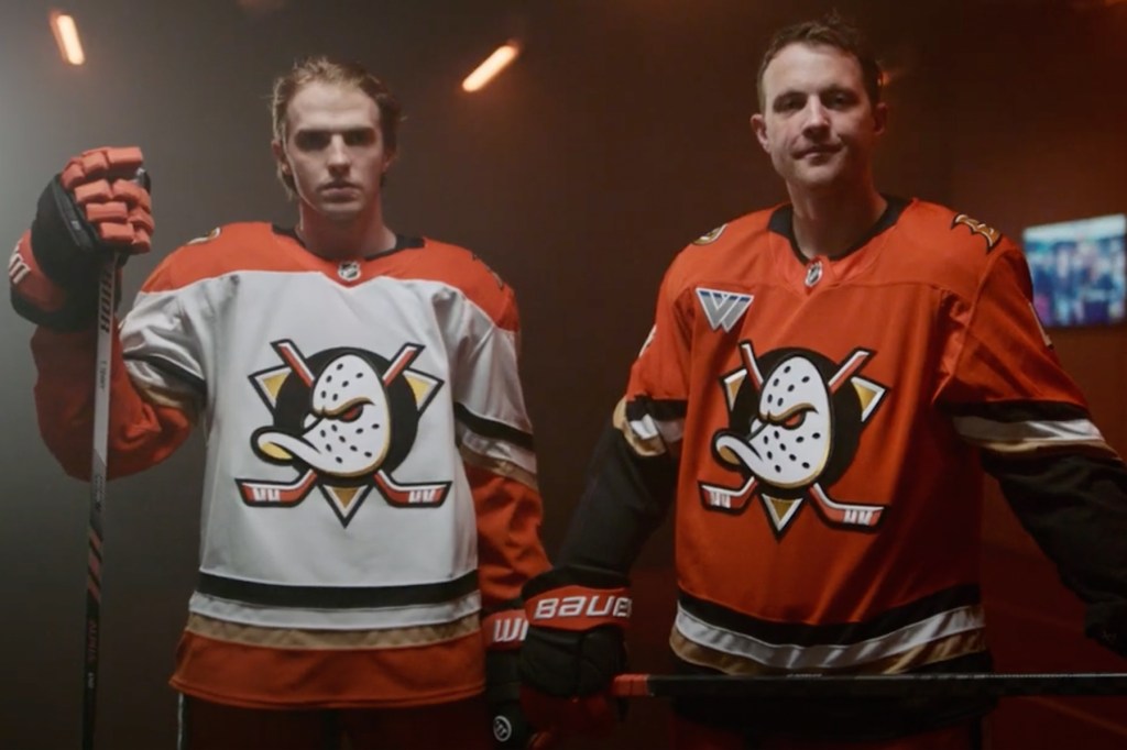
The Anaheim Ducks and the Los Angeles Kings have introduced the latest evolution of the franchises’ branding as well as uniforms and I think it’s fair to say their fans are going to be VERY pleased.
Whether it helps either team on the ice remains to be seen. The Kings currently have +2200 odds on DraftKings Sportsbook to hoist the Stanley Cup, while the Ducks are projected to be near the bottom of the league with odds of +15000.
In the below video from Twitter/X and in an article on the team’s website, the Ducks note that the team’s legendary Disney-era logo is back after years of fan feedback/requests. Only now it is “framed in vibrant orange as the bold primary color reflective of the team’s home in Orange County.”
A tribute to our legacy, with eyes on the future.
— Anaheim Ducks (@AnaheimDucks) June 26, 2024
You’re entering Orange Country. pic.twitter.com/oXF8lTV7Os
The team says the more aggressive orange eye present on the new iteration of the beloved 1990s-era logo represents a commitment “to be faster, more exciting and more aggressive than ever before, both on and off the ice” as well as “the miles of powerful Pacific Ocean rock reef and beach-break waves that crash up and down the coast” as seen in the teaser tweet the team posted earlier this week.
Something stirs beneath the waves…
— Anaheim Ducks (@AnaheimDucks) June 24, 2024
The tide turns Wednesday morning. pic.twitter.com/oz34TwiNcI
That orange color honoring Orange County is front and center in both the new home and road uniform kits, with the team saying its rebranding efforts honor “Anaheim’s unique citrus heritage and the enduring spirit of hard work it symbolizes. A refined crest inspired by the original primary design of the Mighty Ducks, this refreshed primary symbol embodies the commitment to our community and fans as we further cement our hockey legacy, carrying forward with pride and passion.”
The team’s home jersey will be primarily orange with black, white and gold accents, while the road jersey will be white with a healthy dose of orange accents throughout, including on the shoulders, chevron sleeves and at the bottom of the jersey. So while clearly reminiscent of the team’s beautiful kits best remembered from the Paul Kariya–Teemu Selanne years, the Ducks clearly have put a greater emphasis on the primary orange color than the team ever did with its former primary purple color. It appears that commitment to the color orange will extend to the uniform pants, gloves and home helmets. If you like the color orange, these uniform kits are for you.
Sportslogos.net recently had an X post wondering would you rather have the retro Mighty Ducks logo with the most recent black and orange colors the franchise had been using or the more modern Ducks webbed D melded with the classic purple and teal of the team’s 1990s identity.
“Would you rather” Anaheim Ducks edition…
— SportsLogos.Net (@sportslogosnet) June 24, 2024
The throwback Mighty Ducks logo in modern orange and black
– OR –
The modern “D” Ducks logo in the original dark purple and jade
What’s more important to you?
Throwback fans: You gotta decide if you prefer the original colours or… pic.twitter.com/dYZMmgWoIU
Clearly, the team has chosen the former. I think it’s fair to say that these new uniforms immediately rocket to near the top of the league standings, if not at the very tippy top. With Fanatics taking over as the NHL’s official uniform supplier beginning next season, it will be interesting to see the actual quality of the new uniforms, both on ice and in the stands, but at the very least they light the lamp when it comes to aesthetics.
Also today, the Los Angeles Kings introduced new uniforms that harken back to the 1990s, with the team re-embracing their black, silver and white identity.
Woven into the fabric of Los Angeles.
— LA Kings (@LAKings) June 26, 2024
https://t.co/0vaApVA21I#GoKingsGo pic.twitter.com/X5nuorj4Oz
These look almost identical to the kits rocked by Wayne Gretzky when he arrived in L.A., although obviously flipped to where the majority black uniform with silver and white accents will be worn at home and the white sweater with silver and black accents is set to be worn on the road. The team says the “new primary mark for the Kings draws inspiration from the classic 1988 logo — which debuted in 1988 at the same time the Kings acquired Wayne Gretzky — yet incorporates subtle differences that modernize the design.”
I also think these will be among the NHL’s best next season. What can I say, I’m a sucker for the 1990s aesthetic. But for what it’s worth, Roy Bellamy of The Dan Le Batard Show with Stugotz is also a fan of the Kings’ new look.
Its a damn near perfect uniform https://t.co/C7NTpp0dcd
— Roy Bellamy (@roybelly) June 26, 2024
So which of these kits do you like better? Do you like the throwback inspiration? Do you wish teams would leave the past in the past? And how confident are you in Fanatics to deliver quality uniforms given the issues surrounding MLB’s new uniforms this spring? Hit me up on X — my username is @byAndySilva — to share your thoughts!