The Major League Baseball All-Star Game dates back to 1933, and the Midsummer Classic has always been a chance for the best players in baseball to go head-to-head in an exhibition game that also serves as a ceremonial midway point to the long MLB season.
Since 1997, the MLB has created special edition jerseys for the occasion with some hits and some misses. Normally the jerseys are designed around the city that hosts the event with “American” and “National” jerseys for each player.
For the 21 years from 1997 to 2017 players wore the special jerseys for the Home Run Derby but the regular jerseys for the actual All-Star Game. In 2018 and 2019, the players wore the special jerseys only on All-Star Workout Day with their regular jerseys worn for the derby and game.
After the COVID-19 pandemic canceled the 2020 Midsummer Classic, the MLB decided to go even more all-in on the special editions with players wearing regular jerseys in the Home Run Derby but wearing the All-Star threads in the actual game itself. This year will be the fourth year using that plan.
Over at DraftKings Sportsbook, Pete Alonso is currently a +320 favorite to win the Home Run Derby and the National League is a +100 favorite on the Moneyline.
Regardless of exactly when it was used during the weekend, Major League Baseball has created a total of 27 special edition jerseys. Let’s break them down and rank them from worst to first.
27. 2021 (Colorado)
The 2021 #MLB All-Star Game jersey is navy blue for the AL and white for the NL. Team abbreviations in red placed vertically behind team logo with a floral pattern on each sleeve. Jerseys are two-button BP style and will be worn in game.
— SportsLogos.Net (@sportslogosnet) June 24, 2021
See the rest here https://t.co/cWy8jaR2Il pic.twitter.com/0rnjspEy9E
The All-Star Game in 2021 is the year where things went wrong with All-Star Game apparel, in my opinion. This was not only the first year that players wore the special unis instead of their regular uniforms, but these specific jerseys were especially flawed. The trim on the edges is kinda fun, but why place the logo and the three-letter team abbreviation on the same side of the front while leaving the other side almost entirely empty aside from the small swoosh? The logo and the three-letter abbreviations compete especially badly in some designs and come across as either repetitive (like the S on top of SEA) or make the three letters difficult to distinguish (like the MIL or TEX designs). To be clear, these deserve to be in last place for the design itself, but they also deserve to be in last place because they started the trend of every year having these uniforms as the main game uniforms for the teams. Don’t even get me started on the purple star behind the red logo on the hats in this set.
26. 2024 (Texas)
Major League Baseball has released the uniforms for its upcoming 2024 MLB All-Star Game in Texas. Cream and coral for the AL, dark blue and light blue for the NL.
— SportsLogos.Net (@sportslogosnet) July 4, 2024
My story with pics of all 30 teams and some history here: https://t.co/rNnooCuM0C pic.twitter.com/JgkaBpXlGl
This year’s jerseys have some cool elements that I like, but the color combo is wild. I’m not sure how “lush coral” and bright blue become the colors of choice, and there hasn’t really been much explanation. It looks like the Flint Tropics color scheme and turning the logos and stripes on the hats to those colors isn’t good either. The set of hats that came out alongside this version where the team colors were maintained behind the logo are much better, but the funky colors are definitely turning this year’s uniforms into one of the weirdest sets in a while. Unlike the iconic colors brought into uniforms in the past (more later), these two random colors don’t have much connection to the Rangers or the state.
Ultimately, the All-Star Game is just an exhibition game, and these uniforms make it feel very much like a beer league or little league game where the teams tried to get too crazy with colors. The only good thing coming out of the outcry over these “out-there” unis is that there seem to be more and more people calling for a return to regular unis for in the game, which I strongly agree is the way to go. I’m good with fun jersey combos for the Home Run Derby, as you’ll see below, but keep them out of the actual game, especially when they look like this.
25. 2000 (Atlanta)
This was the second straight year the MLB went with the vest look; however, the vests from 1999 were much better since they actually fit. In 2000, the MLB Home Run Derby had all kinds of sleeve issues. Maybe it was the players’ bulging biceps, but they seem very boxy with an odd multi-layer look. They added a small “2000” above the “National” and below the “American,” and at least they fixed the names and numbers on the back (more on that in the 1999 analysis below).
24. 1997 (Cleveland)
Chipper Jones, Ken Griffey Jr., Kevin Brown, Barry Larkin and Jeff Blauser at the 1997 All-Star Game pic.twitter.com/XhY82gSEBM
— BaseballHistoryNut (@nut_history) February 8, 2022
The first set of the special jerseys was pretty straightforward. The NL had blue jerseys with red piping and the AL had red with blue piping. Each league included the secondary All-Star Game logo, replacing the second “A” in each league name with a star. They also featured the team logos as a patch on one sleeve. Overall, they weren’t awful, but also weren’t great, either. They weren’t as thoroughly planned out as later versions, but the fact that they were just for the derby keeps them from ranking lower on the list. They did start the madness, though, so if you hate all things MLB All-Star jerseys, you can blame this look.
23. 2022 (Los Angeles)
MLB and Nike have unveiled the jerseys for the 2022 All-Star Game in Los Angeles ⚾️ pic.twitter.com/oyDHBuvDJs
— Front Office Sports (@FOS) July 11, 2022
2022 was the second year All-Stars wore these jerseys as part of the actual game. While these were a vast improvement on the mess of 2021, they still had major flaws. I actually like the gold treatment of the existing team names and fonts and appreciate the tie to the glitz and glamor of Hollywood. I also really like the palm print under the brim of the hat — very cool. However, where these crash and burn for me is the star next to the team’s logo on the hat reads way too much like an asterisk. It was randomly placed around the existing logo, but it didn’t look good in any position. If players wore their normal hats with these, they’d rank much, much higher on the list, but the hats hold them back.
22. 1998 (Colorado)
These were the All-Star uniforms worn during the Home Run Derby when the Midsummer Classic was last in Colorado in 1998. pic.twitter.com/oj55XwnTAj
— Gershon Rabinowitz (@GershOnline) June 24, 2021
In the second year of the MLB making special uniforms, they leaned into the purple in the Rockies logo since they were in Denver at Coors Field. The purple piping on the AL black jerseys and the NL green jerseys worked nicely, and instead of a secondary All-Star Game logo, they added the mountains as the second “A.” Like the initial foray into special jerseys, these are simple and not a full kit, but these were a step in the right direction.
21. 2003 (Chicago)
#OnThisDay: July 14, 2003
— Los Angeles Angels (@Angels) July 14, 2020
GA came out victorious over a familiar face in the Home Run Derby. pic.twitter.com/OXlHbmmiAY
Since the game was at the home of the White Sox, there weren’t many color options for the MLB to choose from. As a result, the NL wore black with white and the AL wore white with black. The piping and striping were consistent with that season’s batting practice jerseys. At first, the MLB announced that teams would wear this in the actual game, but fans pushed back and that plan was abandoned (at least for the next 18 years).
20. 2023 (Seattle)
The 2023 #MLBAllStarGame jerseys will be paired with the mint-coloured caps we saw last week, the AL All-Stars will wear white pants, the NL All-Stars get navy blue.
— SportsLogos.Net (@sportslogosnet) June 30, 2023
Much more in my story here: https://t.co/Ka9luMF856 pic.twitter.com/3tLTpBZLGh
Last year was by far the best set of in-game uniforms, but they still get ranked near the bottom just on principle — let players wear their team’s jersey in the game!
OK, that said, the Pacific North colors and the navigation theme for the “A” at the end are pretty solid and the mint hats aren’t bad either. I still hate the star on them, but at least it’s much more subtle and before the logo so it’s not an asterisk. These are the best of the bunch when it comes to special edition uniforms worn in the game, but I’m so against the concept as a whole, that I can’t rank them in the top 20.
19. 2001 (Seattle)
After spending two years experimenting with a vest look, the league went more traditional with the 2001 kit. The white piping and traditional jersey design work with the nautical rose of the Mariners logo swooshing around the lettering instead of incorporating into the word as they did in 2023. The “Northwest Green” of the American League’s jersey is solid and would rank higher, but the red from the NL jersey doesn’t seem to have much basis aside from a contrasting color from the logo.
18. 2014 (Minnesota)
For the first time, the league created a special version of each team’s hat for the All-Star Game, starting the trend that led to the entire new uniform sets each season in the current format. The red and blue of the Twins was used as a solid base for this uniform set with the wordmarks “American” and “National” decorated with stars across the top. There isn’t a ton going on with these compared to some other designs, but my main issue is that there’s nothing that makes them distinctly tied to their location like some of the stronger designs still to come on this list.
17. 2004 (Houston)
#LunesDeLeyenda
— LasMayores (@LasMayores) September 24, 2018
Home Run Derby 2004. ⭐️
¿Reconocen a todas estas leyendas?#LasMayores pic.twitter.com/t77Qm4zF4q
The league did a great job with these simple designs that brought in elements from past Astros jerseys in lettering and colors. The only big miss here was not being bold enough to bring back “Tequila Sunrise” in some way. Still, an overall solid set of jerseys for batting practice and the Home Run Derby.
16. 2019-Cleveland
The 2019 #MLB All-Star Game BP Jerseys. pic.twitter.com/sRgAd88iAr
— Michael Baron (@michaelgbaron) April 12, 2019
The MLB went back to the vest look but this time over a gray undershirt for their 2019 Workout Day jerseys while players wore their regular jerseys in both the All-Star Game and Home Run Derby. The guitar on the front as a nod to the Rock and Roll Hall of Fame is enough to keep these from being lower on the list, but the hats with the crossed bats aren’t great since the team logo is such a small part of it.
15. 2006 (Pittsburgh)
The Pirates hosted the 2006 All-Star Game, and both league’s jerseys were based on their black-and-gold template with plenty of red mixed in. If you like the color combo, these definitely work, although there isn’t a ton of creativity going on. To me, these are fine for a derby and batting practice look.
14. 2002 (Milwaukee)
Although the result in 2002 was the tie that caused so much uproar, the jerseys weren’t bad at all. The script on the jerseys mirrors what the Brewers use and the colors were also loosely based on the Brewers’ primary colors. The American League version had a little texture on the Navy print which I like and the gold National League version was the basis for a Brewers alternate jersey the team used shortly after the game.
13. 2010 (Anaheim)
This is half a great set — the 2010 designs work perfectly for the American League using the “A” with the halo, just like in the Angels logo. The typeface and color scheme is solid, and I’m a fan right up to the point where the “N” in national gets a halo. I’m not sure what I would have done differently to get around the problem of fitting one league perfectly while the other is awkward, but this set feels a little off as a result.
12. 2005 (Detroit)
Having the colors from the Tigers to work with resulted in orange and blue jerseys in 2005, and the look came together nicely. This year was one of the better versions of the Home Run Derby looks and had additional styling around the American and National wordmarks. Each participant also wore the flag of their home country, which was a nice touch, especially with the first World Baseball Classic getting hype at the time.
11. 2011 (Arizona)
After going with the “batting practice” style jerseys for several seasons, the MLB went back to full button-down versions in 2011. The Dbacks’ colors were front and center with black, Sedona red and sand used on both jerseys. Personally, I would have loved to see the retro purple and teal incorporated, but this is a solid set based on the distinctive look of the host team, so I don’t have many complaints.
10. 1999 (Boston)
Ah, peak MLB Vest era. In 1999, Major League Baseball had some interesting designs, including a whole “Turn Ahead the Clock” promotion. While it wasn’t as far-reaching or as successful as the City Connect editions (see my full analysis here), it was a very unique look with a strong 1990s feel. For the Home Run Derby, each team wore vests with contrasting colored undershirts and the alternate ‘99 modeled after the Fenway scoreboard. The league name written sideways down the left side of the jersey was actually pretty cool, but the reason I don’t like this set overall is that they totally ruined it with the back of the jersey. The name turned sideways with the numbers offset to the side is a no-go for me and drops them several spots down the list.
9. 2008 (New York Yankees)
The send-off season for Old Yankee Stadium included hosting the 2008 All-Star Game. The Home Run Derby is mostly remembered for the Josh Hamilton show, but the jerseys were solid as well. They did a good job incorporating the iconic facade of the stadium and giving it a very “Yankees” feel with colors and piping. No pinstripes were involved, though, which seems like a little bit of a miss. I also prefer the players wearing their own team hats or even a variation instead of just duplicating the jersey on the hat. However, those are nit-picky issues with a pretty solid design overall.
8. 2009 (St. Louis)
Home Run Derby Winner in 2009: Prince Fielder, Milwaukee #Brewers
— Keep On Playing (@ikeeponplaying) June 13, 2018
Home runs: 23
Location: Busch Stadium
Home runs that season: 46#HRDerby pic.twitter.com/PmJ7rr6BqI
It’s too bad 2009 was a fairly forgettable Home Run Derby since the jerseys were on point. Based in St. Louis, they incorporated the arch and the “Birds on a Bat” style of the Cardinals without actually incorporating birds. The NL even worked in the Cardinals’ alternate light blue in the side panel to complete the look. I’m not a huge fan of the hats, but at least they are not just a straight copy of the jersey.
7. 2017 (Miami)
The 2017 All-Star Game was in a tough spot after the spot-on retro version of the Padres-themed jersey the year before (still to come). They tried to follow up on it by using their teal and orange to give the derby some Miami vibes. It kinda worked, and with the All-Star Game logo as the second “A” it isn’t awful. The lettering is consistent with the Marlins’ font and coloring at the time, and it works even though it’s very non-traditional.
6. 2007 (San Francisco)
Like with the mountains in 1998, the 2007 All-Star Game played with the lettering on the front of the jersey a bit and incorporated the Golden Gate Bridge as the “i” in both American and National. The “road” American League got the orange jerseys with black trim while the “home” National League squad went with black with orange trim. The creativity with the bridge look and a solid black and orange color combo is enough to make this one of my favorite Home Run Derby looks.
5. 2015 (Cincinnati)
In Cincinnati, the league kept things straightforward with black and red as the primary colors with a row of red stars under the slightly wavy wordmark across the front. The standout of this uniform is definitely the red and white pillbox cap on the second letter of the wordmark. As far as batting practice jerseys go, these work well (and for the derby too). Actually getting a pillbox cap would have been cool, but this one on the jersey works. The league did come out with a full set of pillbox caps, though, which were a nice look that worked better on some team’s sets than others. I’ll give them some bonus points for that, which puts them just inside the top 5.
4. 2012 (Kansas City)
Feeling blue? If so, this is definitely the All-Star jersey set for you. The mix of light blue and royal blue really works well overall, and the league gets extra points for the hats, which incorporate the “A” and “N” into the Royals logo with the crown on top. The crown also appears above the first letter of the word plate on the jerseys for a nice touch. While it is a lot of blue on blue, there’s no question who the host is for this year, creating a distinctive Royals feel. The set includes enough good accents throughout to make it one of the best.
3. 2018 (Washington D.C.)
From this morning: The 2018 #MLB Home Run Derby and All-Star Game uniforms were released.
— SportsLogos.Net (@sportslogosnet) June 15, 2018
See them all here:
https://t.co/KFgViC5k6B pic.twitter.com/8YUeabK9ZA
Rather than go too hard after the Nationals colors, the 2018 All-Star jerseys leaned into the local feel of the game being hosted in the nation’s capital. The Washington Monument and the Capitol Building are prominently featured in the design and the caps are some of the best in the entire history of the All-Star Game. Some logos definitely work better than others (see the Brewers’ odd red glove above), but the ring of stars around the logo and stars on the brim are good accents. Ironically, these were some of the least seen of all the All-Star designs since they weren’t worn for the derby or the actual game, appearing only on Workout Day. This set is good aesthetically but also gets credit because this is exactly how I’d like to see jerseys used. It’s a fun alternate, very cool, but limited action on the field and definitely not in the main game.
2. 2013 (New York Mets)
Citi Field opened in 2009, and the Mets hosted the All-Star Game at their relatively new stadium in 2013. The team’s orange and blue provided a great color pallet and the skyline of New York with the nearby Queensboro Bridge stretched under the wordmark completed the look. I generally like the orange and blue color combo, and by incorporating the classic look and city landmarks, the MLB did a great job with this uniform set.
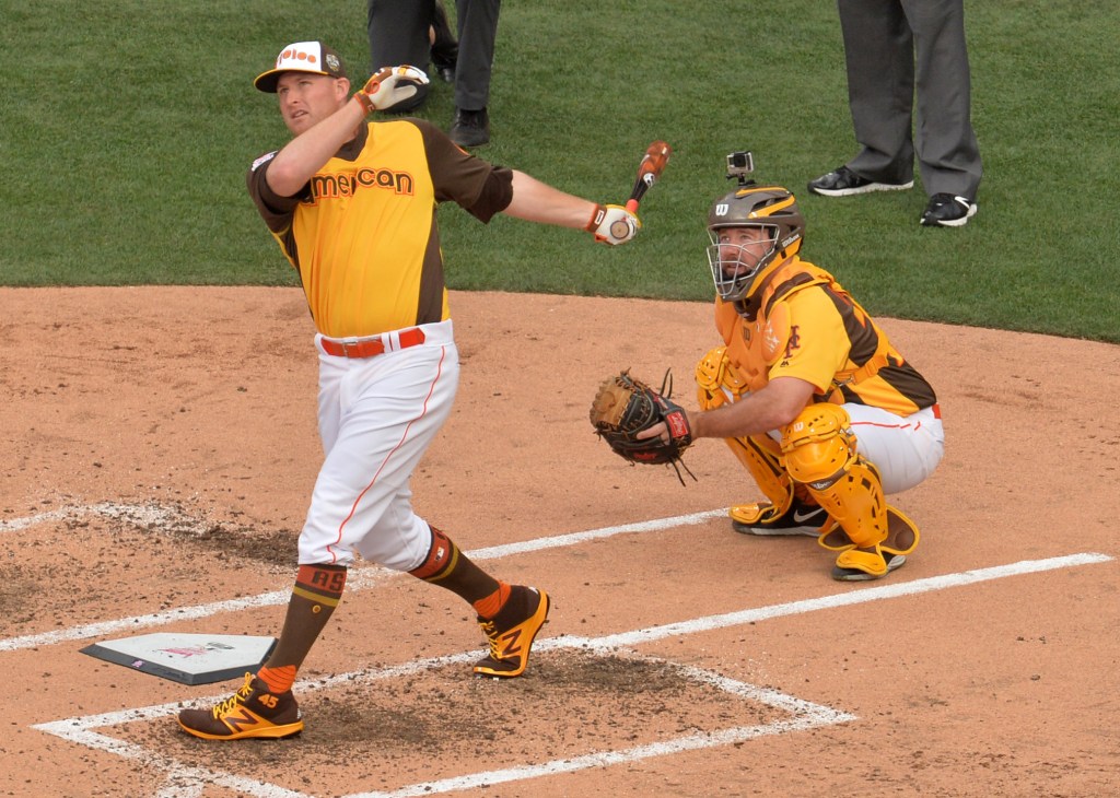
1. 2016 (San Diego)
MLB has just announced the jerseys and caps for All-Star Workout day & the Home Run Derby at @PetcoPark! pic.twitter.com/dqxqDkt6j7
— Petco Park (@PetcoPark) April 13, 2016
If you like the Padres’ vintage mustard and brown uniform set, these are definitely going to be your favorite. As you can tell from its spot on my list, I’m a fan! The league name appeared across the front trimmed in orange, and the team name was on the cap with a similar treatment. This is such a great set, and the only real strike against it is that the T-Mobile sponsorship led to a mismatched pink and silver Home Run Derby logo on one of the sleeves. Other than that, these are a home run for All-Star jerseys and work awesome for the derby. I still wouldn’t want them in the regular game, but for derby attire, these are at the top of the list. They were such a hit, that the Padres went back to these as their primary colors in their most recent uniform update in 2020.
So those are my rankings. Do you agree? Disagree? Think I missed something in one of the designs? Whatever you need, you can find me on X (formerly known as Twitter) @ZT_Sports where I’m always happy to break down the latest looks and also offer my DFS and season-long fantasy advice.